The Browsable Grid
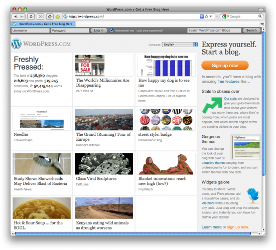
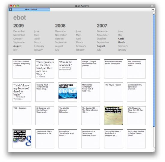
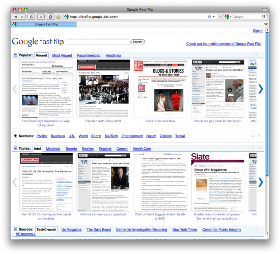
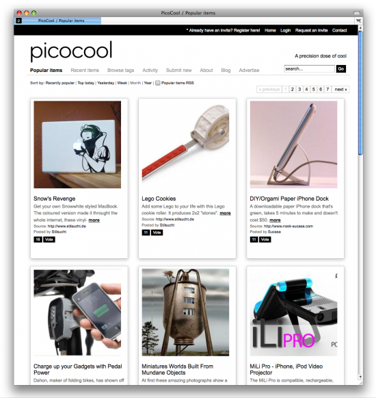
Several sites, including my own PicoCool, are taking advantage of the grid view as a fast way for users to browse content. Designers have been relying on the grid for generations as a layout technique. Lots of data-driven sites (eg. product comparisons or search results), web 2.0 services and blogs let users toggle their view of content between list view and grid view. List view has become synonymous with seeing extended details or descriptions, while the grid simplifies and presents content visually. A few years ago, I wrote that new methods of visualization and discovery were being created (and needed) to deal with vast amounts of content and participation. Today, we’re seeing a return to a trusted visual structure with this week’s launch of Google Fast Flip, Tumblr’s Wire, as well as the recent redesign of WordPress’s home page, and the earlier New York Times article skimmer. This time, it’s still about discovery, but with a greater emphasis on speed and browsability.
The New York Times Article Skimmer


Tumblr‘s Archives


4 Comments
Join the discussion and tell us your opinion.
960 Grid, Blueprint, CSS…all frameworks I’m following. This whole 960 grid though…wondering why sites are at multiple widths over 960 then? Why is 960 the optimum, or do you have to stick with that? Is it just recommended or should you be strict about the 960 methodology?
I like the whole concept and i find these grids to be real nice
designer grid
Similarly useful and discoverable, although not exactly conforming to the grid layout is Digg – Newsified. Still, it’s more evidence of the move to ease-of-discovery.
Awesome.
Don’t forget MobileMe’s photo galleries :)