Twitter for iPad
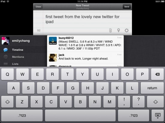
Just downloaded the first version of Twitter for iPad (iTunes link) and trying it out. On first glance, love the clean, properly-sized UI. Try pinch/zoom on a tweet to see more info. Pinch again to close. Swipe down with two fingers to see a thread. The “write a tweet” view overlaps a bit much for my preference, but otherwise, really liking it so far. If you’ve had the iPhone version, delete it from your iPad, then reinstall from the App store.
UPDATE 9/2: After playing more with the app, I find the sliding panels helpful, but feel like there’s too much horizontal stacking/sliding. It also seems impossible to permanently get rid of a panel detail once it’s open? You can flick it to the right but it still lingers there.
In terms of functionality, there are a few things missing from this version, although I suspect they’ll be coming in the next:
- ability to save searches
- delete DMs (and mark all as read). Actually I’d just like to see this synced across all Twitter apps so if I’ve read a DM before, it doesn’t show up on the desktop client or iPad as unread.
- geo-location for tweets
- see local trends, not just global trends


1 Comment
Join the discussion and tell us your opinion.
Just downloaded it too! It’s very nice and clean. :)