Design something original
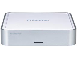
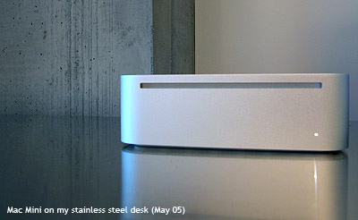
Princeton Technology has created a hard drive that’s “inspired by” the Mac Mini, so much so that it really looks just like it other than the logo etched on the top and side.. not the kind of font that Steve Jobs would approve. Frankly, I like the silver-white-milky aesthetic of the Mini’s design and Apple’s glossy white image, but then I confess to loving most things sleek, silver, and minimal.

The Princeton drive (shown above), though, is as big as the Mini but doesn’t come with the cuteness factor for me. Aesthetically, the design doesn’t extend or improve upon the Mini’s design so much as merely imitate it. I know that imitation is supposed to be the sincerest form of flattery, but what every happened to originality? And, who’s to say that Apple’s design team always knows best? I’ve been an Apple fan since I was 13 and my parent’s bought my brother and I our first Apple IIe, and needless to say, this one company’s product design has certainly shaped and influence my creative output for the last, hmm, twenty years. But, I’ve also had extreme Apple rage – like when they drop last year’s “greatest product ever” for this year’s. Or, when the promise of the wireless lifestyle doesn’t mesh with reality (like my giant Apple cinema display monitor that I bought last year has the wrong format now for this year’s laptop, unless I want to keep using the hugh power adapter that has two long cords running out of it. But, I digress). With so many design solutions possible, it would simply be refreshing to see manufacturers giving their product designers the freedom to innovate instead of imitate.

